
Role
Lead Product Designer
Type
Mobile Design, HTML, Javascript
Duration
6 Weeks
Team
Tian, John
CORE: Transferring Desktop-Only Tool To Mobile
CORE's current internal table was data-heavy and restricted only to desktop making it difficult for staff to document, update, and manage the space on the go
The Challenge
The original platform was unresponsive making it difficult to view and update donor details other than on desktop
Client Ask: Take the current elements of the internal Trackerboard and AOC Form translate it to mobile layout that will be easy to digest and interact with
Core Issues:
Not mobile adapted
Doubled staff workload
Left staff unable to update items
Trackerboard
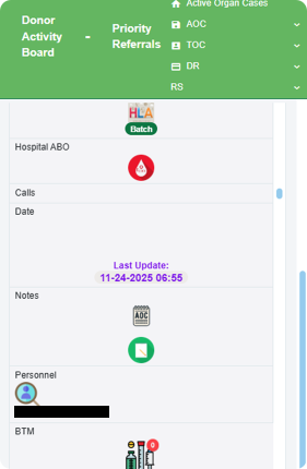
AOC Form

The Solution
Mobile Platform specifically designed and adapted to Administrator on Call (AOC) workflow to ensure strategic efficency
AOC Specific Home Dashboard

Notification & update sections for after each shift + handovers
Task List adapted to individual AOC tasks
One tap access to high priority active organ cases
AOC Specific Trackerboard
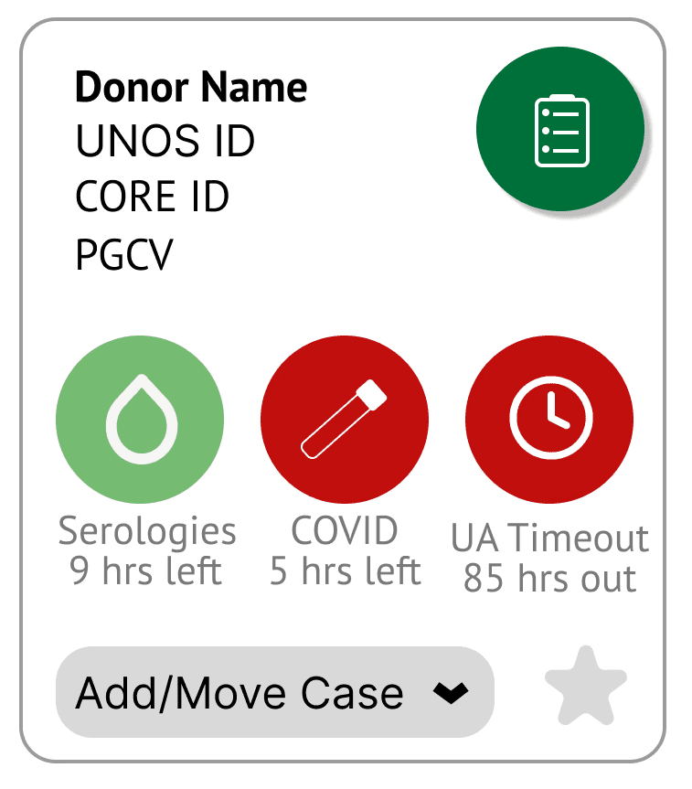
Card design for mobile use vs. original desktop design
Time sensitive donor data displayed immediately
Easily move cases to wherever needed
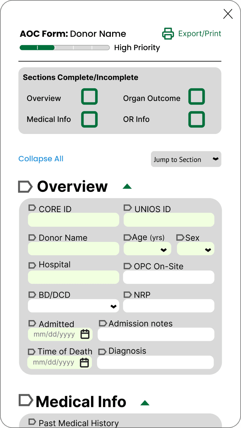
Mobile AOC Form
Familiar information order for quick inputs
Collapsable sections for visibility
Progress bar designed for AOCs workflow
The Impact
Provided a proof of concept for dev handoff and validated new design system transfer
Core Impact:
Achieved a 94% success rate in completing critical workflows without assistance, validating mobile redesign
Provided client handoff and confidence to move the project into full-scale production
Documentation and design helping future Spring 2026 dev team quickly go through the development process.
Finding the Scope
With our short timeline, we needed to narrow our scope to specific user and case type to prioritize features
CORE Staff Roles
Tissue Operation Coordinators
Tissue donation workflows
Usually on desktop
Administrators on Call (AOCs)
Deals with high priority & active organ cases
Most likely to be on the go
Types of Cases
Pending Cases
Active Organ Cases
Administrators on Call & Active Organ Cases: most time sensitive and on the go constraints making it imperative to have a mobile platform for them to accessibly do their required tasks
A Key Interview
Sitting with Nikki (senior AOC), we were able to learn about the specifics of their workflow and what they generally prioritize during their shifts
Pain Points & Highlights
Handovers are done via the notes section of AOC Form
Heavy workload, resulting in forgetfulness or miss task
Repeated work, noting information on paper then transfer to digital
AOC Process Flow
Individual Donor Flow

Design Choices
Balancing visibility and familiarity for mobile design to ensure smooth transition for the AOCs and less cognitive load
Keeping the AOC Form Input Field Order for familiarity
During interviews, discovered that AOCs naturally fill AOC Form in a certain order.
Broke down the form into sections/groups
Jump to section feature → Less scrolling on mobile
Keeping on the go, flexibility, and time sensitivity in mind

Desktop Table Layout to Individual Donor Cards
Prevent mobile cluttering & prevent mental overload
Preserve quick scannability of multiple donors
Cut mobile scrolling time for time sensitive situations

Task List for heavy workload shifts
Prevent error in a time-sensitive and strict donor environment
Reduce cognitive load, confusion, missed tasks and mistakes
Assist with morning handovers transition periods

User Testing: Lo-Fi to Mid-Fi
Making things glanceable for time-sensitive contexts
Determining most vital Donor Data
With three rounds of user testing, we iterated and displayed most vital information based on feedback to prioritize the most valuable information.
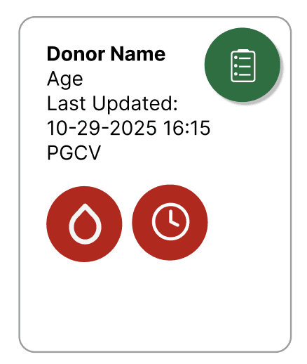

Green and red fills made it quick for AOCs to determine what was expiring soon
Desktop Table Layout to Individual Donor Cards
Prevent mobile cluttering & prevent mental overload
Preserve quick scannability of multiple donors
Cut mobile scrolling time for time sensitive situations


Removed BTM -> AOCs did not use this data point
HLA, Hospital ABO checkmarks because one-time tests, not time sensitive
Refinements: Mid-Fi to Hi-Fi
Cutting redundancies and user click count by incorporating pop-up screens for quick navigation on the go
80%
of participants struggled to return to original page after navigating to AOC Form
With the pop-up, 5 clicks were reduced to 1 click, preventing user confusion and AOCs giving up!
Changing AOC Form List to Export/Print Page
90%
of participants felt that the AOC Form List redundant for their workflow

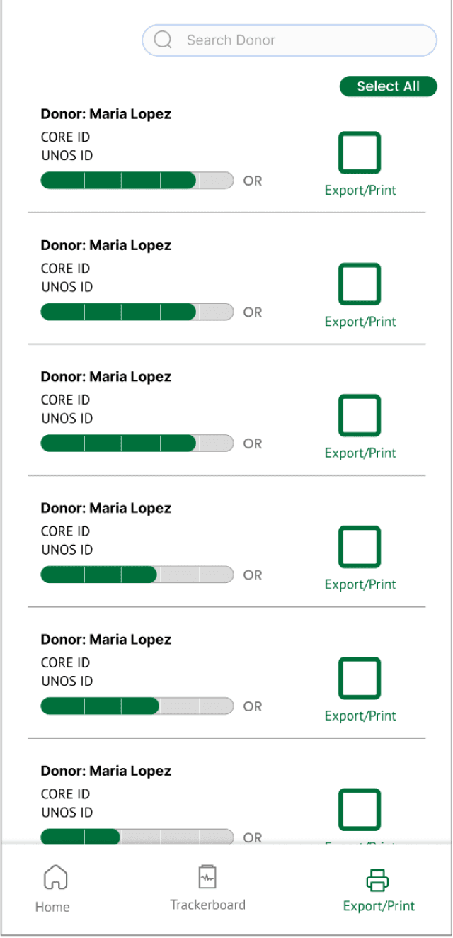
Changed page to Export/Print page to make AOCs morning huddles easier to print out specific donors on the go!
Design Advocacy
Navigating stakeholder skepticism with the AOC Form progress bar
Every AOC fills the AOC Form differently from others; some fill every field from the beginning with N/As, some leave things blank.
It was difficult for AOCs to tell which stage they were at with each of the donors


Client was initially hesitant, felt that it would clutter the UI instead
Advocated for the keeping the feature justifying it initially with Nikki's recommendation
Recommended and provide proof of necessity with user testing results
At final presentations, client mentioned his initial doubts but was now convinced
Final Iterations
Providing a proof of concept for dev handoff using HTML and Javascript
We provided our client with clear documentation and our Figma files for the development team.
